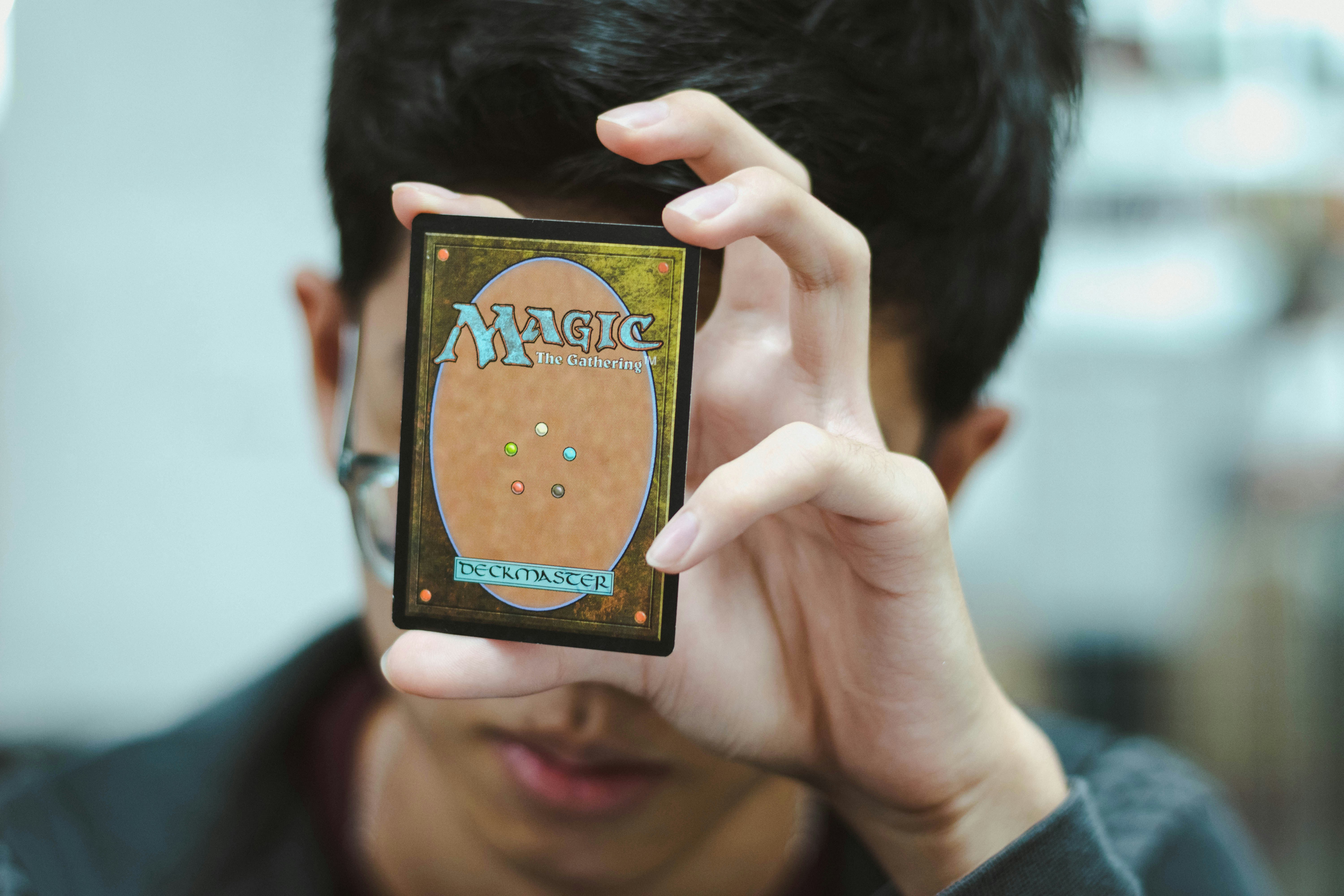
This article assumes you have "some" knowledge regarding what Magic is and how the game is played.
Strixhaven was released about a month ago and despite the set having very little ROI as seen in the below video, it was attractive enough of a theme to pull me back into playing MtG Arena again.
The sound of a pack opening can probably wake someone up from a coma
There's something about Magic the Gathering that attracts me as an enthusiast and I don't know what that is. However, if I had to guess, it's a number of factors:
1. The layout
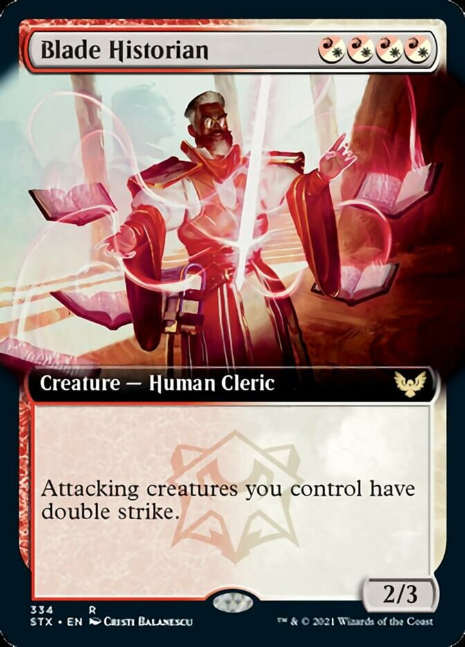
On the left is a normal Blade Historian and on the right is the extended art variant of the card. For those who don't play MtG:
- Top right is the mana cost to summon this creature (combination of 4 red/white mana, or {R/W}{R/W}{R/W}{R/W} for short)
- Top left is the name of the creature
- Mid-left is the creature type
- Mid-right is the set symbol - Strix means owl. The color represents "rarity", from common to Mythic
- The text box has...text and sometimes a logo as seen here.
- Bottom left has the card no., rarity, set abbreviation, language, artist
- Bottom right Power/Toughness if it's a creature, as well as WoTC trademark
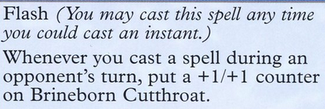
All the information is clearly seen and may be defined within the text box in case someone doesn't know what a certain term means:
Evidently, Wizards of the Coast has had 30+ years to perfect the layout of the cards so it's no surprise that each info snippet is where they should be. The art is complemented wondrously, becoming as eye-grabbing as possible while staying within the confines of the border - as in the case of the left card.
There's a certain sense of stability here. All margins are balanced, there are borders outside borders and each 3D shape is confined in a box with shadows. All aspects of the card seem solid and clean.
It feels good to hold it in my hands.
2. The font
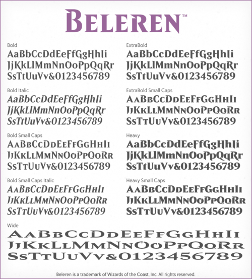
WoTC has their own proprietary fonts - a combination of Beleren and MPLantin/MPLantin Italic if we were to cut it close. The artist of the font has a really good write-up here
Point being? This combination of fonts has been researched/judged/recreated under critical eyes and feedback, all to create something that blends fantasy and clarity. Quite the feat if you ask me.
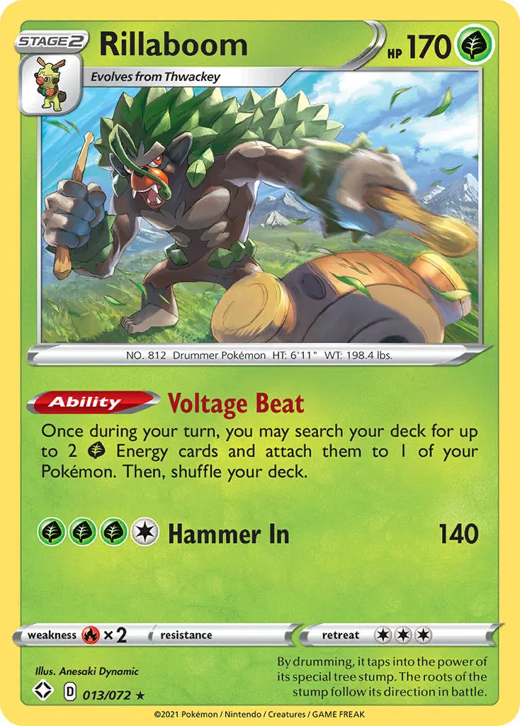
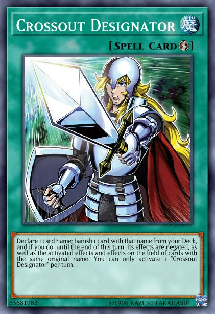
The font's individuality stands out especially when compared with other TCG cards:
Hearthstone and Runeterra are online-based, so clarity is prioritized and I have no qualms with them using an Arial based font. The 2 cards are just there to be points of reference.
As for Pkmn vs Yu-Gi-Oh! vs MtG, the difference is noticeable because when it comes to consistency, as the spacing and alignment of MtG is still one step above the others.
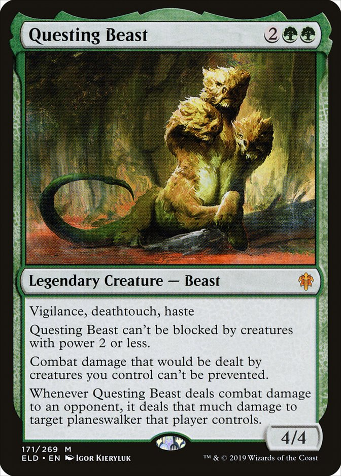
Another aspect I noticed is that there's no stark difference between font sizes within a Magic card. It would seem WoTC has delved into visual clarity research quite a bit because it's very easy to read content inside a Magic card, even in extreme cases like Questing Beast where there's a lot of text.
3. The art & design
a.k.a the strongest pull that makes WoTC money - how the art is presented. A collectible card game will go nowhere without its artists at the forefront.
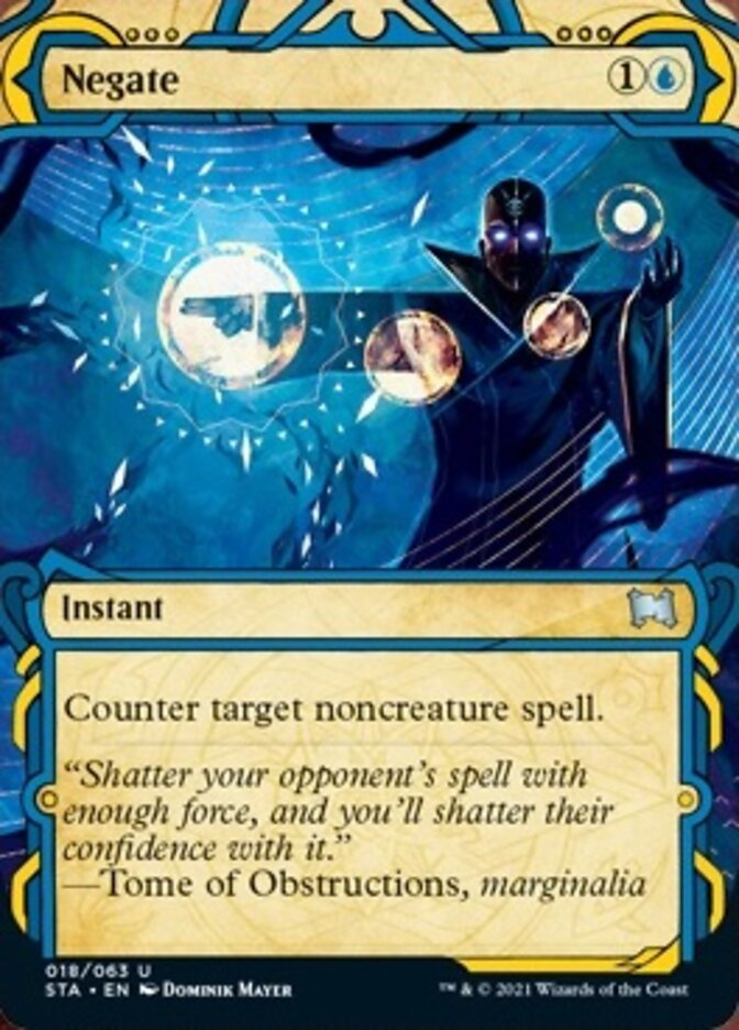
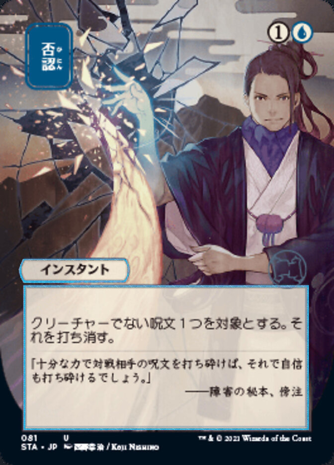
Every now and then, WoTC would include "variants" of a card in a special design, like these ones in Strixhaven:
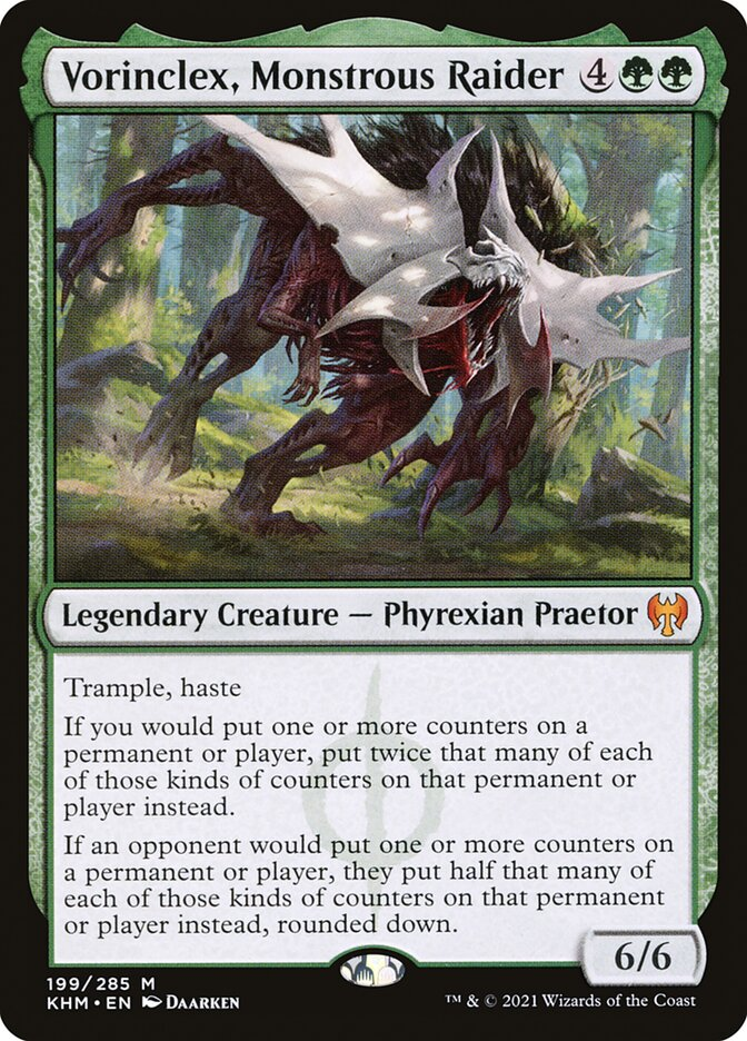
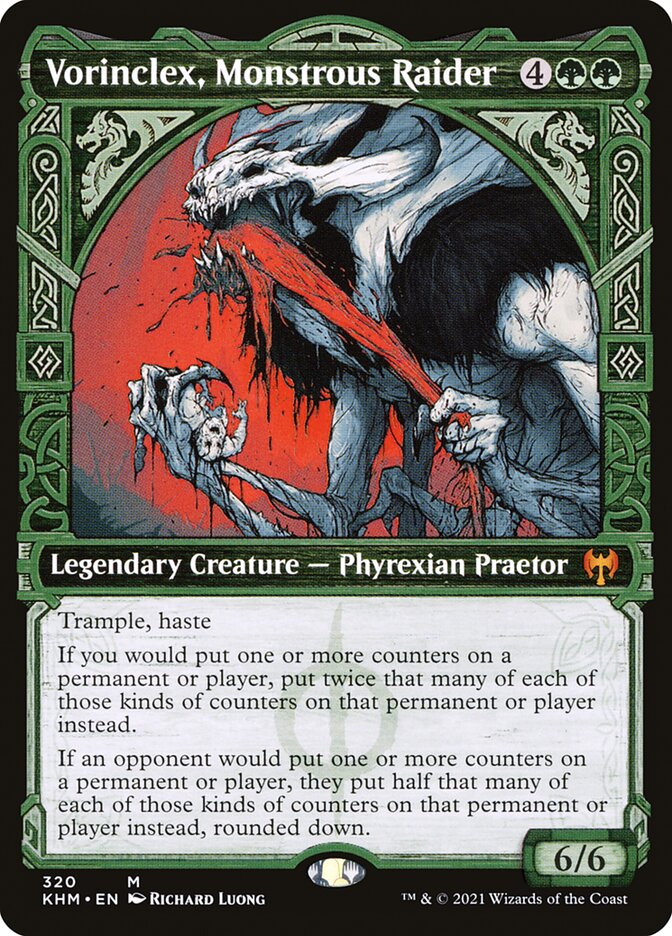
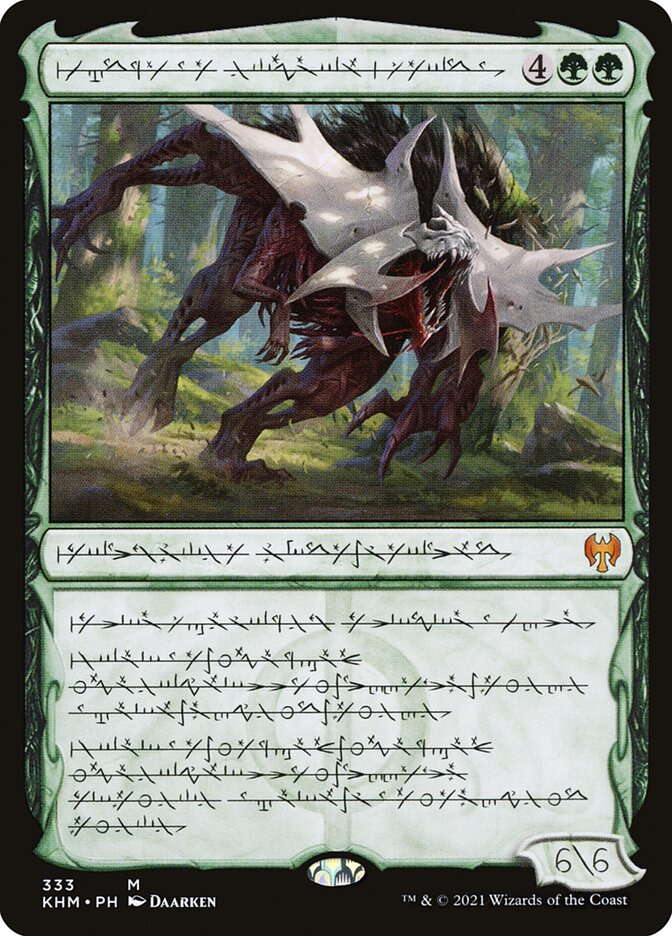
Another example from the Kaldheim set. On the right is the card with all the text in Phyrexian, an in-MtG language. Even THAT font looks sick as heck!
I noticed that most art for MtG is very high-quality so I did some research into how WoTC chooses the artists. Here's an answer from /u/VaporLeon for those curious:
Most art is Wizards reaching out to artists directly. However as a fledgling artist, obviously they can’t know everyone so you can submit art as others have said. But they also send people to conventions and the like to scout. They also do a bit of background work to make sure they like who the artist is (see people they’ve mentioned never to commission again). Lastly, most of their cards look same-y. I have some artist friends that have only gotten a few cards and want more, but their normal art is so far away from magic art that, personally, I don’t believe Wizards thinks of them much. That being said, one just got a few promotional cards in an upcoming set so that’s something. So realistically, focus on your art. Maintain an professional image that Wizards likes. Then cross your fingers and hope they like you. Talking to an agent at big events helps tremendously. If you go to events (even if not in them yourself) walk and talk with those in Artist alley to see how they “broke in.” Most just got lucky I think.
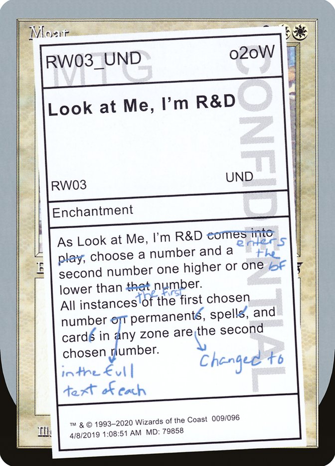
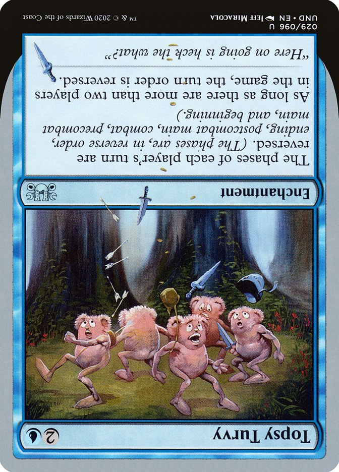
Speaking of design, how can I not mention the Unsanctioned set?
4. The mechanics
That's all I need to give you. Every new set will introduce or bring back a mechanic that has been used before, where it will become favored for a short while because of synergy with a new card. This keeps old sets fresh and usable in Modern or Historic → Collectible value skyrockets → The trading scene remains active.
Closing thoughts
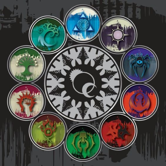
I didn't pay much attention to MtG until Arena was released and Guilds of Ravnica was in Standard. To this day I still think it's one of the best sets to introduce new players to the game as you have so many choices of guilds which correlates to the type of magic you want to play. This flexibility is what makes MtG such a good card game compared to others.
That said, it's a huge shame the Arena client is not getting fleshed out more. Even though the popularity of Magic isn't dwindling by any means, I believe that so many more people will enjoy the game more on Arena - especially during social distancing periods - if there are more types of events (phantom drafts, trial decks, etc...) or more QOL features.
For now, MtG remains the crème de la crème of TCGs to me. Will that change in the future? Probably unlikely.
